Tagged: user interface
- This topic has 8 replies, 3 voices, and was last updated 2 years, 5 months ago by
 Draise.
- AuthorPosts
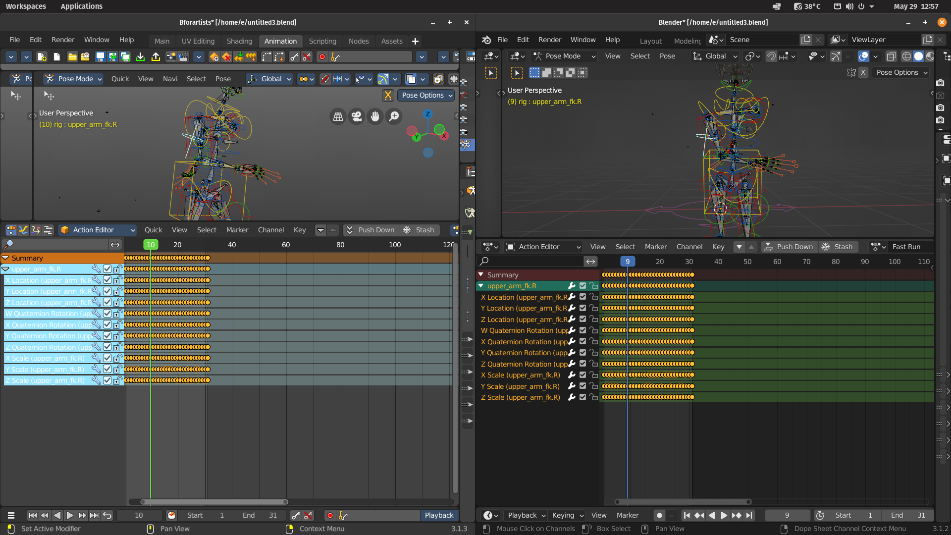
Cyan BG and white text is a poor choice. Other times, Yellow BG and white, can’t see a damn thing. I am impressed with your improvements, hoping you can make it even better.
BFA<- -> Blender

Hi Eric,
This can indeed be improved. You can make a tracker entry for it if you want 🙂
Kind regards
Reiner
This is my signature. You can change your signature in the profile
I’m new here, how do you make, what and where is a tracker entry?
The tracker is located here. https://github.com/Bforartists/Bforartists/issues
You can also access it from the Help menu in Bforartists. It is basically, you report a bug. But we are also happy about feature requests 🙂
Kind regards
Reiner
Attachments:
This is my signature. You can change your signature in the profile
Hey there, saw the request. Yeah it’s a valid one. So I made a task for it.
https://github.com/Bforartists/Bforartists/issues/3030This post has received 1 Likes.:dance:
Hey eric,
Just wanted to tell you that we are at it. We have a light green against white battle. But we still try to find out where the cyan color comes from. Our theming does not have this color.
Can it be that you still run a old theming of Bforartists? Could you please rename the Bforartists folder in the appdata directory for a moment, and have a look if the cyan color vanishes by that?
It is in C:\Users\YOURUSERNAME\AppData\Roaming
Kind regards
Reiner
Attachments:
This is my signature. You can change your signature in the profile
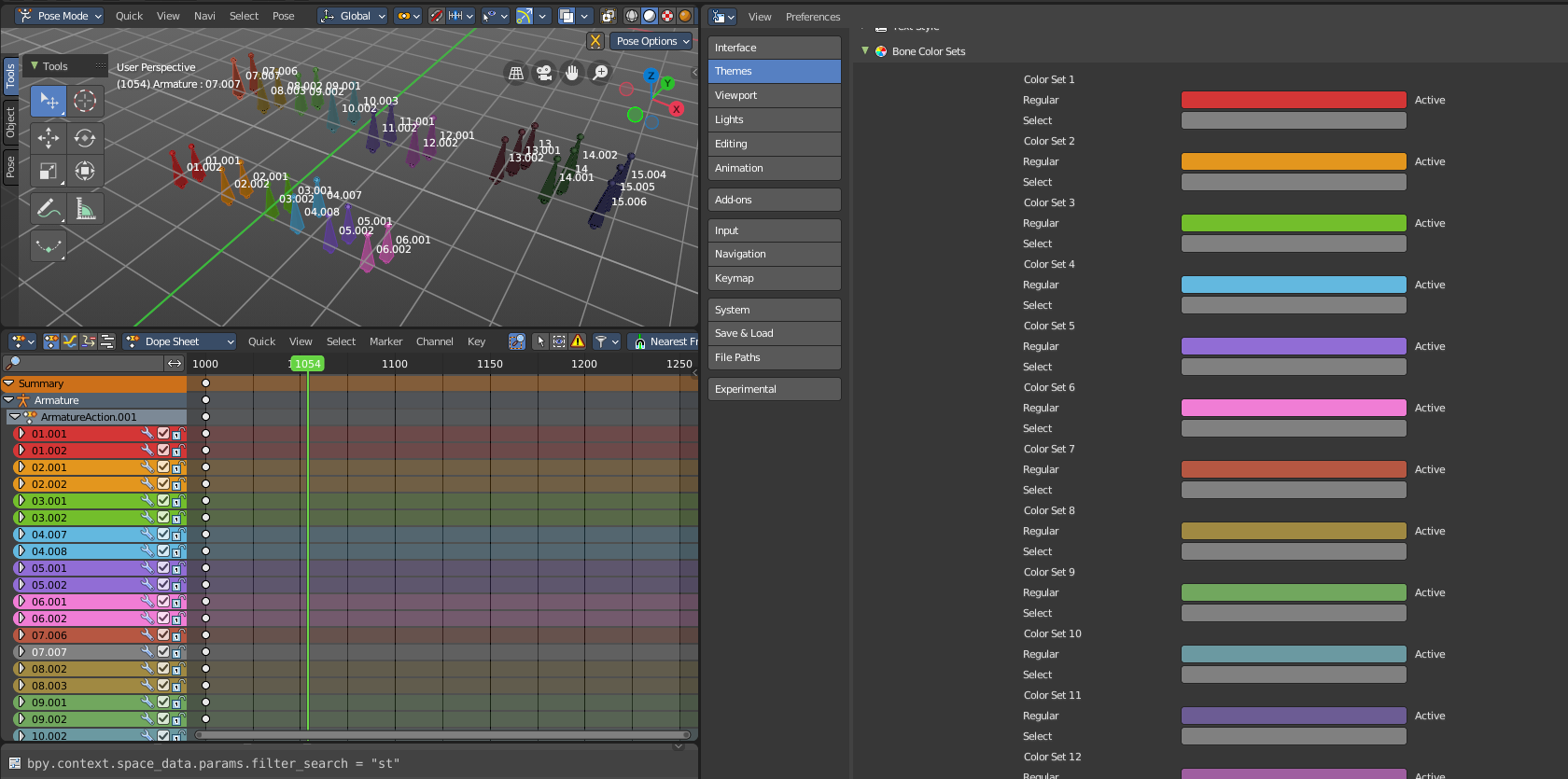
I just commited a fix to make the colours have a wider range of levels, hue and also made sure the highlight was legible on the channels. I also worked the contrast of the colours a bit more with the text – so it should be much more legible now.
As mentioned, if you are using an older theme or a custom theme, this will change. This is set per theme settings, but hopefully our defaults will help!

:dance:
What does it look like when you select those tracks?
Would be a neutral grey, white text. Blender highlight colour is NOT directly linked to the highlight colour in the 3D viewport. And unselected tracks have the same colour as the highlight colour. So the only method really is white text as the true indicator of being selected, so white text on neutral grey had to do here. Nuetral grey so black text can also be legible.
:dance:
- AuthorPosts
- You must be logged in to reply to this topic.


