Bforartists is a fork of Blender improving the UI and the usability. While there are some things equal to Blender, there are also big differences. These differences are the reason for the fork.
First of all, let me point out where Bforartists is equal to Blender. Those are the features, tools, and addons that work like in Blender. We usually don’t touch this part. You can even work on .blend files simultaneously in Blender and Bforartists. The blend files are 100% compatible. And what can be done in Blender can also be done in Bforartists.
The UI, the handling, and the documentation are the points where we largely differ.
We cannot explain every little change that we have done. As we work since 2015 on this project those changes go into the thousands. But we will provide one or two examples for each category.
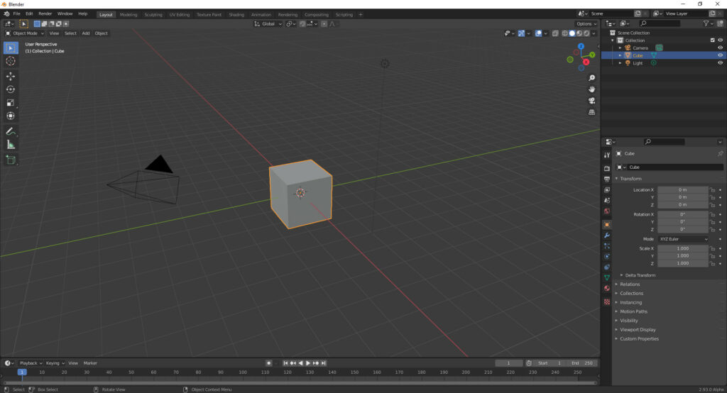
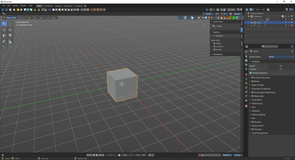
The images are from Bforartists 2.7.0 and Blender 2.93 Alpha.
Have also a look at our comparison video on Youtube. It is made with Blender 3 and Bforartists 3
An own keymap, which is reduced to just the necessary hotkeys and a navigation that can be purely done by mouse.
Hotkeys to call tools directly are important. They can dramatically speed up the workflow once you are comfortable with the tools. But the Blender and Bforartists keymap not only contains this kind of hotkeys. It conatins every user interaction. Like navigating in the viewport. Or the interaction with the tools in the tool shelf. Or to move the timeline cursor in the animation editor.
The default Blender keymap has still most of the key entries from Blender 2.79. It hasn’t changed this much. And this brings the old problems from Blender 2.79 to Blender 2.80 and higher. The keymap is counter intuitive. The SRG navigation is not easy to discover. They also still add hotkeys to even the most oddest tools. And so you are in trouble to add your own hotkeys since nearly everything is occupied already.
We have reduced this by a big amount. And we use the WER navigation scheme, which is standard in lots of common 3D applications. And last but not least, our viewport navigation can be purely done with one hand by mouse. No need to hold down any key if you don’t want to.
You can of course also use the Blender keymap in Bforartists. We offer alternatives, we don’t dictate. So you loose nothing.
Cleaned up User Interface. Lots of unnecessary double, triple or even more identical menu entries removed.
We have removed lots of unnecessary double menu entries. In Blender 2.79 i managed to find a menu item that was six times implemented in the UI. This is better now in Blender 2.80 and up. But still too many. They even introduced the next double entry problem with the new tool shelf, which is one gigantic double entry to the very same tools in the text menus. Just the handling differs.
One of the most prominent examples of such a double menu entry even in the old menus is still the mark and clear seam feature. It currently exists three times in the Blender UI. Well, sometimes it makes sense to have a double entry. The entry in the context menu might be debatable, and fall under this category. But not between the Edge and UV menu, which are directly besides each other. No wonder the Blender UI looks so super complicated. It is not, it is just super crowded because of all the repetitions.
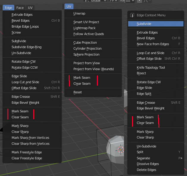
The Blender Way
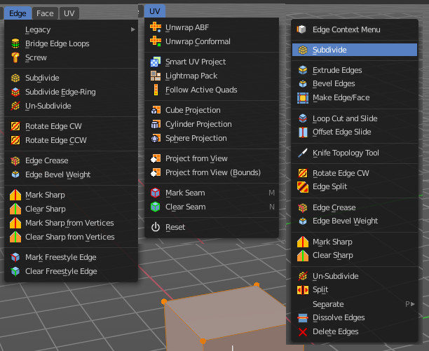
The Bforartists way
As told, the right click context menu is disputable. And so we keep it the Blender way. But our regular menus are a tad bit shorter here and there by removing the doubles, and so they are much easier to read and to work with. And here you also see the other big difference. We have colored icons. And we have it everywhere. This makes navigating in the menus much easier.
We also hide away what is not needed yet. And mark the corresponding checkbox then with a triangle button. So that you know that there is hidden content.
Blender sometimes greys out the content, which is visual noise then. And sometimes it hides the content away. Completely arbitrary. And in some cases you don’t know that there is hidden content at all.
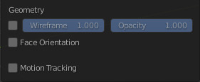
The Blender Way
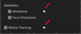
The Bforartists way
Extended User Interface. Many tools that were formerly hotkey only have a menu entry now.
Blender 2.79 had over 100 hotkey only tools, with a toolset of around 1500 tools at that time. Not to discover that they even exists. This has become much better in Blender 2.80. But there are still quite a few hotkey only entries.
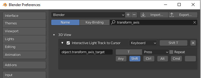
For example the special navigation hotkeys for lights. Power and Angle is just in the contextual right click menu to find, by coincidence. And interactive light track is not existent in the visible Blender UI at all. Hotkey only. We have added these entries to the end of the Object menu. They show when you have a light of the right shape selected.

Another good example, have you ever wondered how much pie menus are available in Blender? In Bforartists you can see them in the UI, in the View menu. And you can add a hotkey here.
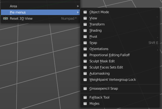
Rearranged User Interface. Some things are better accessible now, some are not so much in the way anymore.
In a good designed UI often used tools and settings should be at top level UI and easy accessible. Not so often used tools and settings can go into a deeper hierarchy. And the UI should be target leading and self explaining.
A prominent example is the camera. You have two modes when you are in camera view. The one allows to navigate in the camera like in the 3d viewport. And the other is to move the camera passepartout around. Both have their use.
The first thing that happens in Blender when you switch to camera view and try to pan is you box select instead. This default box select will trap you again and again in more than one situation.
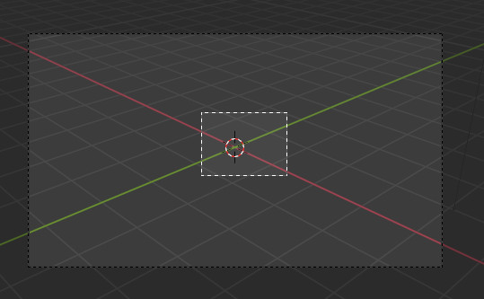
After you turn off the box select you might want to pan the view. So you click with the middle mouse and hold down shift. Whoosh, out of camera view since you have clicked too fast, and shift wasn’t down yet. Or you have touched ctrl instead of shift. The curse of a navigation hotkey made of two keys.
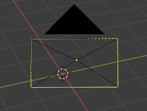
Back in camera view. Hold down shift and mmb. And now you … move the passepartout. Still no camera navigation. Because the camera navigation is in the wrong mode.
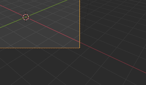
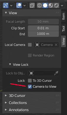
Now you might start to search. And you might with lots of luck find the correct setting in the sidebar in the View tab. With a crazy name that you would never think this could have to do with camera navigation.
Tick it, and you will finally be able to navigate in the camera view like in the 3d viewport.
And now the Bforartists way: Simply switch to Camera view. There is no need to do more. You can already navigate in the camera like in the viewport.
And the switch to move or scale the passepartout is one click away, in the header. It appears when you enter the camera view.
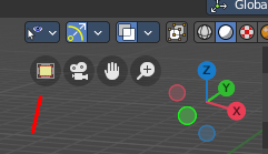
This is also a fine example why Defaults really matters! Navigating in the camera is essential. Moving the passepartout around optional. And that’s why navigating in the camera is our default. And moving the passepartout the second option.
Better Defaults
We have for example removed the standard cube at startup. Or improved the performance settings defaults in the compositor
Colored and as double as much icons than Blender
We had above already an example of the colored icons. We have more as double as much of the small icons than Blender. We have reached the 1500 icons value. Blender has currently 669 of them. Monochrome. And the very most of them plain white.
To give you an idea why white icons are a bad idea, just try to tell a programmer that the colored syntax text hilighting has to be replaced by black and white since it looks more modern. You don’t even need to be a UI designer to understand that this is no good idea. The next bad idea is to switch to a bright theme with white icons …
Colored icons really makes a big difference in navigation and usability. They lead the eye, they make navigation easier. Especially when you have lots of tools, and a big wall of content in front of you. In long text menus for example. But also for example in the list of available modifiers.
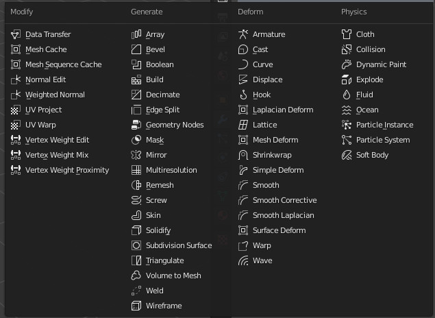
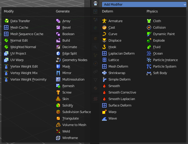
A configurable toolbar with icon buttons
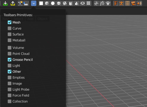
The toolbar editor is one of our core pieces. We have a toolbar editor with a to some degree customizable toolbar right at the top. No need to dig for most used tools in the menus. Just activate them in the toolbar, and the tool is one click away now.
This is for example useful for creating primitives. When you work with lots of curves, just activate the curve toolbar. When you never work with a grease pencil, then turn off the grease pencil toolbar.
This toolbar is an editor type. This means you can even have more than one open, with different content.
Customiztation is one of our goals. Since every artists has different neeeds.
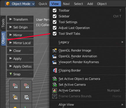
Tabs in the tool shelf
We have resurrected the tabs in the tool shelf. Panels stays open. And they can be pinned to be at the top UI level. Which allows a much faster workflow.
Improved layouts
This point isn’t as valid as in Bforartists 1 days. The workspaces are in big parts equal to the ones in Blender nowadays. The differences are existent but marginal. Some fine tuning here and there.
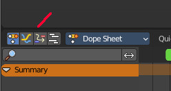
However, we have the standard cube removed. And we have things like tab buttons in the animation layout. They allow you to switch between the different animation editor types Dope Sheet, Graph Editor, Driver Editor and NLA Editor quickly. Same between outliner and properties editor.
And layout is not only workspaces layout. Our headers are not made of three areas, but two areas. Left the tools, right the options. This is wildly mixed in Blender. Tools and options can be literally everywhere. There is no structure really. And we have changed quite a few default values.
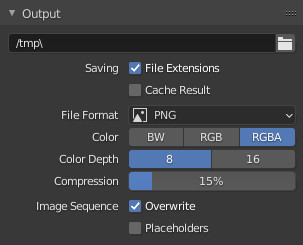
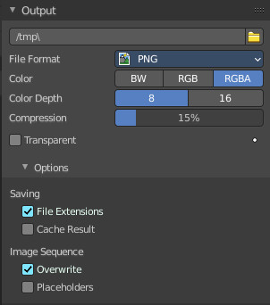
Left aligned checkboxes and text where possible
This is something very obvious, but obviously not obvioius enough. In the western world we read from left to right. This was also true in Blender up to 2.79. Then came the first incarnation of Blender 2.80. With right aligned props and text in the panels. Well, to be fair, they have “fixed” that one at one point. Now everything is middle aligned. And now you need to read from the middle to left and to right.
Better tooltips
Blender has more than once the same tooltip for two or three tools at once. And the user then needs to guess the functionality.
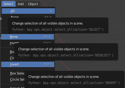
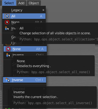
In our tooltips the tools all have a name. So that you can talk about the tool. This is not always given in Blender. The text menu items usually doesn’t have a tool title. And much more neither. Our tooltips contains the tool names where possible.


And we have really descriptive tooltips.


Better readable standard theme
From a UI design point of view the contrast between the elements to read and the background should be above 160 of 255 greytones. This is simply not given in the default Blender theme. It is no joke when i say that i get headaches after 10 minutes in Blender. It stresses my eyes by the low contrast. And the monochrome icons adds the rest then.
Some neat add-ons to improve usability
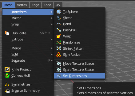
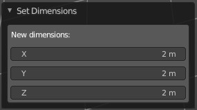
Like the reset 3D View add-on or the Set Dimensions add-on with which you can scale in world coordinates in edit mode.
Reset 3d view is a simple addon that resets the 3d view to the initial state. I personally use this quite often. It is a default feature in nearly every 3d app. Not in Blender. I even tried to commit it, it was declined.
In Bforartists it can be found in the View menu.

When you are in edit mode, and try to scale a portion of the mesh, then this happens relative to the initial scale, which is always 1.
Let’s say you have a table. And now you want to scale the feet to 0.2 units absolute. This is mission impossible in Blender. You have no chance to even know what the current measure of the mesh part really is. The scale tool tells you always 1. It works relative to the current selection.
The set dimensions addon allows you to set the dimensions in world coordinates.
And lots more small details like not so much confirm dialogs.
Also one of those things that has become much better in Blender 2.80 and higher. In Blender 2.79 when you wanted to delete the default cube then you got a warning already. This is not longer the case. But there are still quite a few “do you really want to do this” dialogs around that breaks the workflow.
The rest falls under the chapters cleaned, extended and rearranged. When we find something in the way that could disturb the workflow then we try to improve it.
For example, the Unwrap tool starts with the method Angle Based. But there is also the Unwrap method Conformal available. That’s two completely different unwrap algorithms. Something that most Blender users aren’t even aware of. Since it looks like a Unwrap setting, not a separated tool.


Or simply the size of the quit dialog buttons.


And there are lots more details like this.
Better Manual
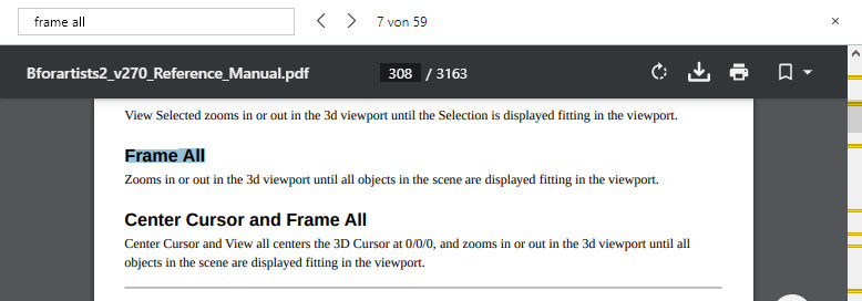
A software is not only code. Documentation is a very important chapter of it. Our manual is better organized. It is divided into the different editors, and into the different editor regions. It comes as PDF, as one big file or in single chapters, which allows full text search. Simply have a look at our manual.
Bforartists 2 Reference Manual
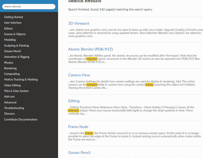
The Blender manual is oddly structured. Your needed information can be everywhere. And the search simply fails in nearly all cases. No matter what tool you search for, you will nearly never get a useful search result. Your best bet is google search in url …
Bravery test …
142 hits, and not a single useful result with the first menu item in the view menu already.
